Fresh
Lush
Maybelline is facing intense competition in the US market from trendy indie beauty brands (such as e.l.f., Fenty Beauty, and Rare Beauty). These competitors are winning over customers by using strong, compelling storytelling.
To stay competitive, the goal of this brief is to create an innovative packaging design for a new, versatile makeup product.
The design needs to specifically appeal to Gen Z consumers in the US.
In short, the brief is asking for a fresh, modern packaging concept that can help Maybelline reclaim the attention of young buyers from popular indie competitors.

Client: L´oréal - Maybelline
Team: Arthur Figueiredo.
My Task: I participated in all stages of this project, from conceptualization and development to detailing.

macrotrends
Summary of market and user research


Bio-minimalism
This trend defines the "Age of Accountability," where the trade-off between "natural" and "effective" finally disappears. In 2026, the industry moves beyond the "less is more" era of simple minimalism and enters the "Better is Everything" era, powered by high-science sustainability.
The 2026 winner isn't the brand with the most "natural" ingredients, but the one that proves Ethics × Performance = Results. It is a shift toward a sophisticated, science-led beauty ecosystem that is as good for the planet as it is for the cells.
Universal Inclusion
This trend highlights a shift from "industry standards" to individual identity, moving the focus from the product to the person. By 2026, beauty is redefined as a global tool for wellbeing that prioritizes inclusivity and functional health.
In 2026, the industry has transitioned from selling an "image" to providing tools for human performance. Beauty is no longer a luxury for some, but a functional pillar of health for everyone.
Skin Resilience
Moving away from aesthetic perfection and toward holistic resilience. Essentially, the industry is shifting from "fixing" to "nurturing."
In 2026, beauty is defined by internal strength. A product’s success is measured by its ability to soothe the mind while fortifying the skin’s biological barrier.


Commitment to use
Gen Z actively pushes brands to be better for the world.They expect brands to commit genuinely to sustainability, ethical practices, ingredient transparency, and inclusivity. And that has tobe shown with transparency. To express these values consistently across every touchpoint, from product formulation and packaging to digital experiences and influencer partnerships. Authenticity is non-negotiable: brands must prove their values through actions, not slogans, or risk losing relevance in a culture driven by transparency, affordability, and community trust.
Diverse with less
Gen Z is demanding greater fairness and inclusivity from brands.They expect products, pricing, and experiences to work for every consumer, across all skin tones, identities, and needs, without exclusion or compromise. Fairness means broad shade ranges, thoughtful formulation for diverse skin types, accessible pricing, 3in1 products and authentic representation, all embedded into the product and routine, not treated as an afterthought.
Wellness-Oriented
As wellness becomes a defining cultural trend, skin wellness follows naturally.Gen Z is questioning not just short-term performance, but long-term impact: Are these ingredients truly safe over time? Do they support overall health, not just surface-level results? Beauty is increasingly viewed as an extension of wellness, where clean, non-toxic, and transparent formulations must benefit both the skin and the body, aligning efficacy with long-term well-being and trust.
SYNTHESIS
Propose a design that resonates with a diverse consumer base, appealing not only to Gen Z but also to broader audiences within the industry, an approach Gen Z strongly values. The design should be intuitive, ergonomic, and easy to use, with refillable solutions where applicable. Additionally, the design should clearly communicate the brand’s values through transparent information, making ingredients and product usage easy to understand and accessible. Transparency and clarity should be embedded into the design, reinforcing trust and long-term engagement. Honesty of use, of color, of sustainability.
look in & look out
Look-in
. Maybelline has a variety of products showing little unity of the brand and harmony along collections.
. Many of the products show the fillings along the outside of the packaging. That is a good thing for Gen-Z.
. If you take away the “instant age rewind” collection, the overall look of Maybelline packaging is a bit outdated, functionality is what we see in use for the past years. Gen-Z wants something new here.
. Not many of the products have multifunctionality.
. Maybelline is a tradicionalbrand and some of this legacyhas tobe kept.


Look-out
. Emotional and sensorial minimalism. Brands are making packaging with emotion through texture, color, and sensorial cues. Rounded silhouettes, few words and strong brand name.
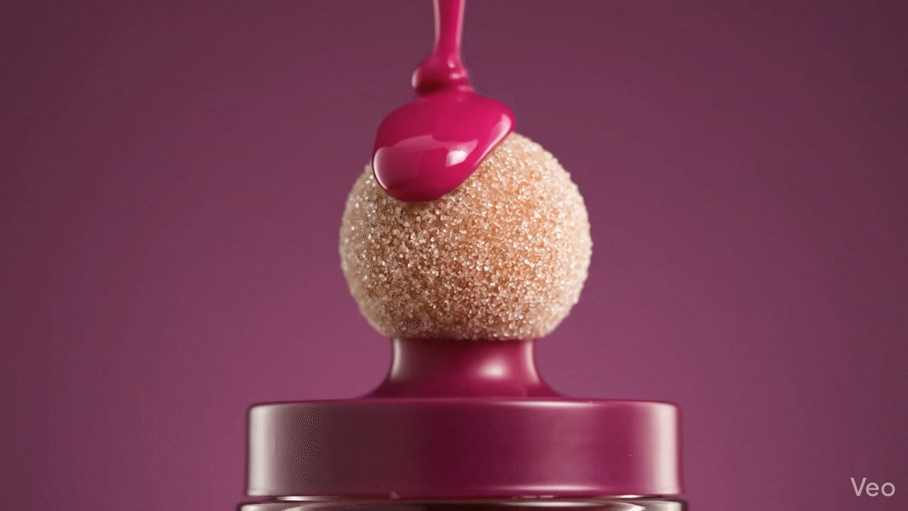
. “Juicy” visuals. The fluids dripping, melting, the translucent packaging are all sensorial aspects of this juiciness. Here it goes beyond packaging reaching art direction as well. Reinforcing freshness, youth, hydration, health. Making this the bridge between the food industry, beauty and tiktok aesthetics.
. Sharp edges are disappearing. US is favoring rounded, soft, toylike forms. Feels less intimidating, more inclusive and easier to use.
. The lines are blurring between makeup and skincare. This reinforces good functionality, skin health and a make up that “treats” you.
SYNTHESIS
A modern, sensorial, and inclusive packaging that feels soft yet confident, minimal yet expressive. The design should convey quality, innovation, and care at first glance, while preserving core Maybelline brand codes and accessibility.
creative direction
moodboard

the concept
Inspiration
Inspired by a fruit salad of cherry, berry, and peach, the packaging translates freshness, hydration, and sensorial pleasure into a modern Maybelline design language. Each fruit represents a core emotional and functional benefit, while together they create a cohesive, contemporary system.


The Pack
The round yet elegant design is a bridge between what Maybelline does today and what Gen-Z feels most comfortable using. The design clearly communicates the brand’s values through transparent information, making ingredients and product usage easy to understand and accessible. Transparency and clarity are embedded into the design, reinforcing trust and long-term engagement. The blurry outside shell shows honesty of use, of color, of sustainability. Lettingyouknowhowmuchyou´veusedof the product.

New Consumers (GEN-Z)
The pack resonates with a diverse consumer base, appealing not only to Gen Z but also to broader audiences within the industry, an approach Gen Z strongly values.To solve this the pack is a modular packaging with different tips and ways of use. For everyone and all to use the way that suits best.


Trigger
The trigger on the plateau of the tip lets you know exactly how many pumps is the perfect amount for you.
Body and Mecanism
Airless pump design that uses a piston system to create a vacuum effect that pushes a plate underneath the product in an upward motion. Letting the dispenser release the product easily after every pump.
Refillable piece
Refillable piece. Comes with product inside. Image is without product for better understanding.

FRESH LUSH


