top of page
A bit of
everything
Passionate about design and its transformative power, I thrive on creating experiences that bring happiness and a sense of connection to people. With a track record of success in the field, I have had the privilege of working with renowned organizations and international clients, delivering innovative and precise results across a range of products. Here is a bit of everything I do.
ID
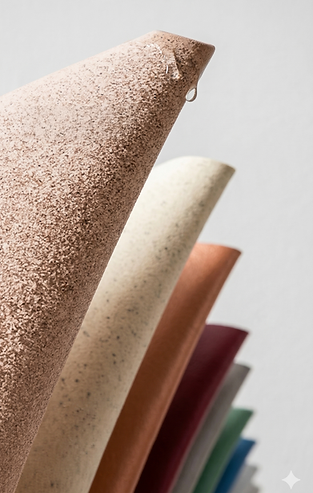


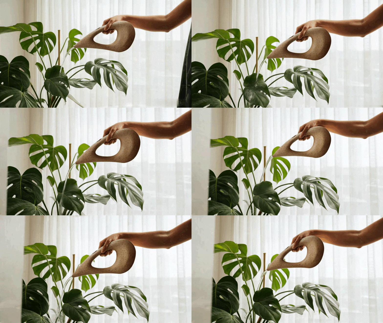
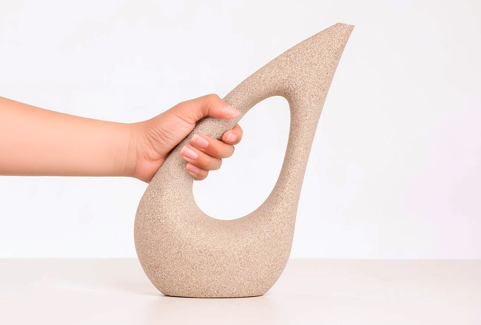
Flua
The challenge was to bring light to an industrial process that is robust and heavy in conventional ideas. The aim was to add elegance to the roto molding process through smooth and fluid curves. The client wanted an iconic product with the materials he had to offer and the industrial process he had to offer and Flua was what came out of this partnershop. The fusion between design skills and engeneering perfection.
Client: Vasap
Director: Guto Indio da Costa
Team: Arthur Figueiredo, Marcus Ribeiro.
@indiodacosta A.U.D.T.
My Task: I was involved in all stages of this project, from conceptualization, development, to detailing.
Packaging


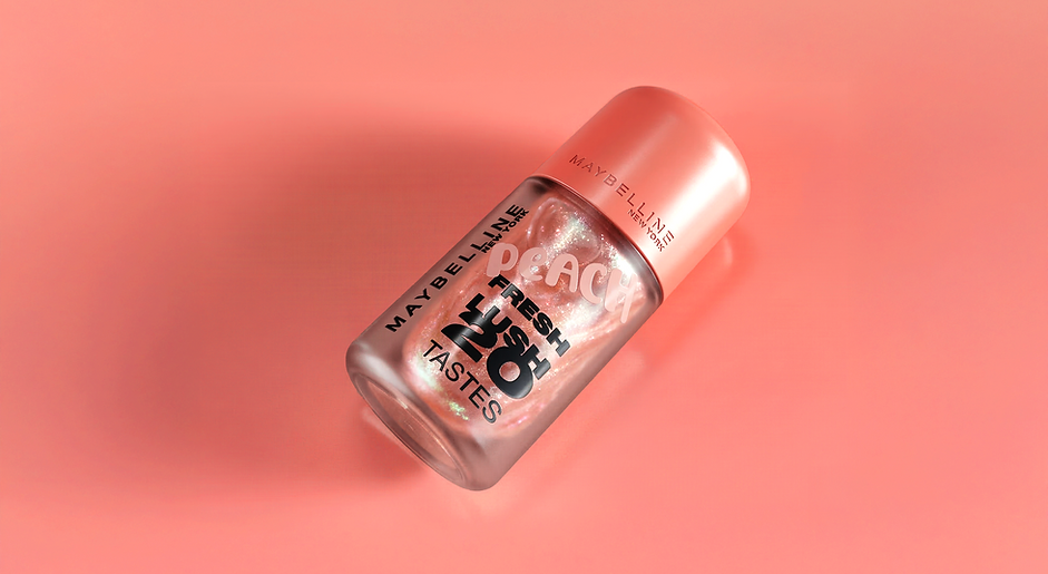
Fresh
Lush
Maybelline is facing intense competition in the US market from trendy indie beauty brands (such as e.l.f., Fenty Beauty, and Rare Beauty). These competitors are winning over customers by using strong, compelling storytelling.
To stay competitive, the goal of this brief is to create an innovative packaging design for a new, versatile makeup product.
The design needs to specifically appeal to Gen Z consumers in the US.
In short, the brief is asking for a fresh, modern packaging concept that can help Maybelline reclaim the attention of young buyers from popular indie competitors.
Client: L´oréal - Maybelline
Team: Arthur Figueiredo.
My Task: I participated in all stages of this project, from conceptualization and development to detailing.

ID


Izylum
The Izylum luminaires, designed for the European brand Schreder in collaboration with the Indio da Costa team, are compact luminaires with the idea of simplifying maintenance and handling. Designed to be efficient, their design minimizes carbon footprint at all stages of their life cycle.
Client: Schreder
Director: Guto Indio da Costa
Team: Arthur Figueiredo, Guilherme de Baere, Marcus Ribeiro and Pedro Antunes.
@indiodacosta A.U.D.T.
My Task: In this project, I participated in the creative process, always considering space optimization to reduce project costs. After the chosen concept, I worked on its development. Another designer from the team handled the final detailing of the luminaire.

Packaging


Aura
To introduce a new global line of prestige women's perfumery that aligns with the brand's essence, enhances well-being, builds Natura Perfumery's authenticity, and captivates through a floral fragrance.
An invitation to be present. Through a memorable fragrance, crafted from white rose, an exclusive rose from Natura, Natura Ava touches and enchants.
Within a bottle, the essence of Natura. Within a bottle,
an act of love that celebrates the power of relationships.
Client: Natura
Director: Fred Gelli
Team: Arthur Figueiredo, Paulo Ferreira.
@Tatildesign
My Task: I was involved in all stages of this project, from conceptualization, development, to detailing. All the way to art direction and photographic briefing.

ID

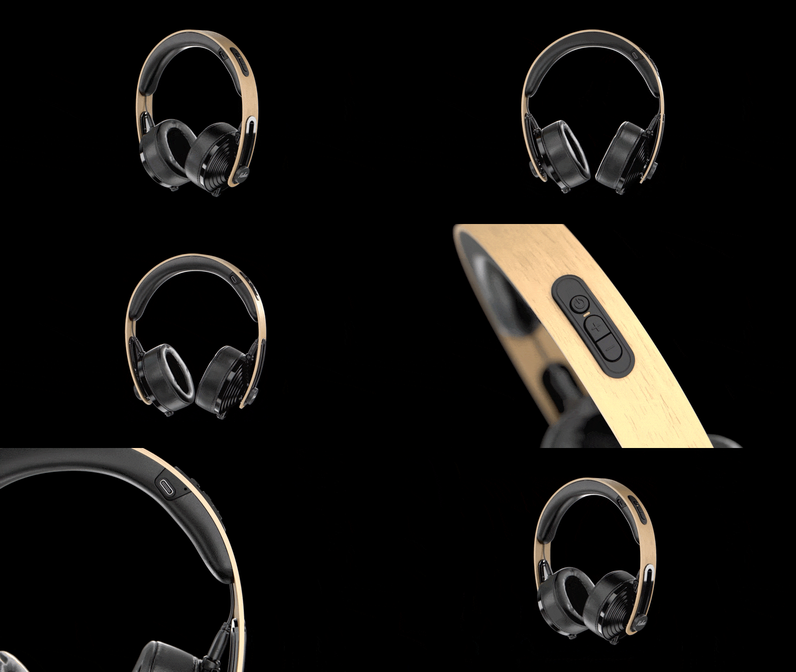
Kuba Bluetooth
The significant challenge of this project was to bring a strong presence and a more robust feel to a conceptually lightweight headphone. We created a headphone with the Kuba identity while ensuring its alignment with market demands. The market calls for a headset that exudes quality and technology, and we achieved just that.
Client: Kuba Audio
Team: Arthur Figueiredo and Marcus Ribeiro
@freelance
My Task: I participated in all stages of this project, from conceptualization and development to detailing. Additionally, I was involved in finding suitable suppliers and producers for the client. The goal was to ensure the project's quality and feasibility, while also aligning materials and production with the established vision and standards.
Packaging

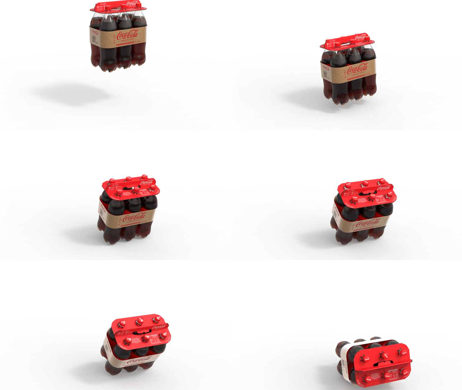
Coca-Cola
Multipack
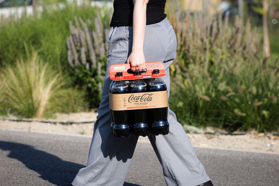
Strengthening Coca-Cola's global commitment to a world without waste, we have materialized the visual and verbal identity of sustainability that we previously created in a new packaging that fills us with pride.
Together with Team Coca-Cola Europe, we have created an innovative Multipack, made from 100% recyclable Kraft cardboard. A small but significant initiative that is capable of reducing around 200 tons of plastic worldwide.
Client: Coca-Cola Company
Director: Patricia Clarkson and Cristiano Gonçalo
Team: Arthur Figueiredo, Andre Stefanini.
@tatil_design
My Task: I was involved in the final ideation stage, and image development.Renderings and final presentation.

ID
ID


Raia
The Raia backpack is waterproof and designed for leisure diving. It was created for beach environments to keep users' belongings safe from beach theft. The concept is to ensure that all belongings stay with the user at all times.
Advisor: Augusto Seibel and Celso Santos
Team: Arthur Figueiredo.
@PUCRJ
Project Purpose: The backpack was created for users who want to go to the beach alone and not worry about their belongings. In this way, when the user wants to go diving, they won't need to ask others to watch their things. They will have the opportunity to take all their belongings with them in their Raia backpack while diving. This allows for a hassle-free and worry-free beach experience, as the user can keep their belongings close and secure at all times.

Packaging


Relip
The project's main goal is to rethink the iconic lipstick packaging of the brand "Quem disse, Berenice?" The given briefing was to reduce the environmental impact of the packaging and extend its life cycle. The objective is to create a more sustainable and eco-friendly packaging solution that aligns with the brand's values and meets the demands of environmentally conscious consumers.
The packaging mechanism was simplified by incorporating a sliding thimble with adjustable locks. This allowed for the use of a single material (PP), making assembly and recycling of the components easier. The streamlined design enhances the user experience and supports more efficient and eco-friendly production and disposal processes. A smaller cap was introduced, with an additional (PP crystal) at the tip to provide a complete view of the lipstick's color. This feature enhances the user experience by allowing easy color identification without the need to open the entire cap, making the packaging more practical and user-friendly.
What changed was not just the mechanism, but also the gesture, which became more intuitive. With a simple slide, the lipstick is exposed and ready for application. This user-friendly and intuitive design enhances the overall experience of using the product, making it more convenient and enjoyable for the customers.
Client: O Boticario
Advisors: Gisela Schulzinger, Yuki Kabe, Andre Giglio and Gabriel Muller.
Team: Arthur Figueiredo, Andre Cavazani, Marcus Ribeiro and Nathanne Siqueira.
@DesafioDesignBraskem
My Task: I participated in all stages of this project, from conceptualization and development to detailing.

ID


Oca
''The Ôca is made of a succession of continuous surfaces that envelop and shape the void. It is a design characterized by purity, continuity, and fluidity, expressed through the combination of minimalist profiles with complex surfaces.
The structure becomes prominent in the design.
The Ôca showcases and takes advantage of its own structure, reversing the traditional logic of upholstered furniture: featuring a slim and entirely explicit structure.''
Director: Guto Indio da Costas
Team: Arthur Figueiredo and Giovanna Leone
@indiodacosta A.U.D.T.
My Task: I participated in all stages of this project, from conceptualization and development to detailing.
bottom of page